29 Jan - 23 Feb 2014
Private Preview: Tuesday 28 Jan 6:30 - 8pm
Artist Talk: Wednesday 5 Feb 7pm - 8:30pm

29 Jan - 23 Feb 2014
Private Preview: Tuesday 28 Jan 6:30 - 8pm
Artist Talk: Wednesday 5 Feb 7pm - 8:30pm
Jim Butler
What the Butler Saw
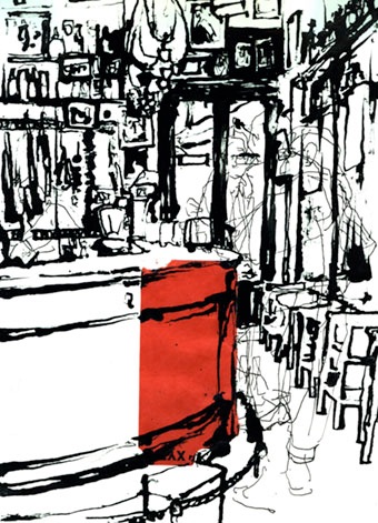
Seville ii
(SOLD)
Jim Butler leads the MA Illustration & Book Arts and BA Illustration & Animation at Cambridge School of Art, Anglia Ruskin University. His work has been exhibited in the USA, Mexico and across Europe, and is held in numerous collections including The Tate, The Art Institute of Chicago and The Hague's Meermanno Museum. This exhibition brings together drawings, etchings and screenprints from four recent series.
Below is a selection of some of the works that will be on show and available to purchase.
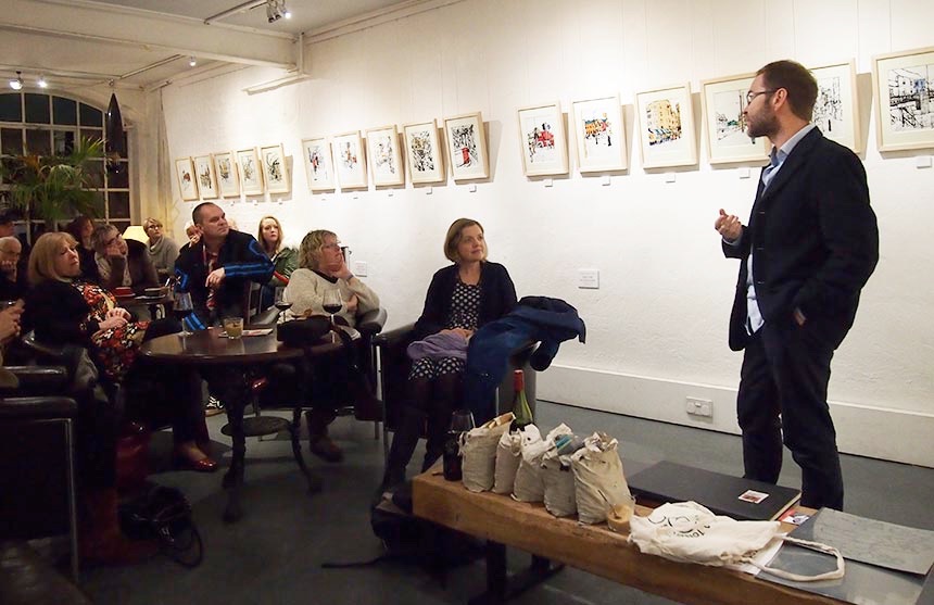
Artist Talk
The talk covered the processes and thinking behind Butler's work. There was a chance to see first-hand the materials, from collage papers and sticks to etched plates and also look though sketchbooks where the ideas are developed.
Cambridge and other cities
The largest series comprises collage drawings made entirely on location in Cambridge and other cities. For Butler, drawing is not a technical skill but a means of slowing down the world for long enough to look and to see. This is a thinking process and the drawings are a record of this. His starting point is deciding what it is in a scene that is visually interesting and finding the composition that allows this to be explored. He carries with him bags of scrap paper, sorted by colour, a stick and a bottle of Indian ink. The collage is made first, maybe finding the patterns of an envelope and the colour of a train ticket that echo the colours and textures of stone in two adjacent buildings. The ink line is drawn over this. For Butler, one of the challenges and thrills of drawing directly from life is to see how the white paper becomes street or building or sky by the use of a single mark or line.
Cambridge Folk Festival
The folk festival etchings are developed from large ink drawings made at Cambridge Folk Festival. These are cropped and drawn on to zinc plates using a sugar and water solution which lifts the varnish off a plate to allow the rough lines to be etched, maintaining the qualities of stick and ink line of the original drawings. This plate is printed in black and a second plate is etched tonally using an aqautint method and printed in brown.
Typographic screen prints
The typographic screenprints have their origins in a very large number of sketchbook collages made in numerous cities exploring vernacular shop signs. This process of drawing and tearing paper directly from observation allows us time to see the shape and design of the letter-forms rather than just reading the sign. In producing the screenprints, all of of the stencils have been hand-made using a variety of materials to maintain the immediacy of the original drawings, while the limited colour palate invites the viewer to see connections across a range of cities.
AMDG
The four prints from the A.M.D.G. series combine etching and screenprinting. These prints are from a larger series which trace a childhood friendship into adulthood. The prints shown here cover the time when they were taught by Jesuit priests. The title, A.M.D.G., is an abbreviation of the Jesuit motto Ad Majorem Dei Gloriam (To the Greater Glory of God). These letters were written as the heading for all school work. Technically, the intaglio elements consist of etched steel plates viscosity printed with white and black or red ink, and hand- cut photo-etched zinc plates. The screen-printed elements are printed from handmade stencils made with a variety of tools, including rubber stamps, lettraset, typewriter, pencil, dip-pen and pint glasses.
Gallery of images
Many of the images below were taken in the gallery, behind glass so the image quality is poor. They all look much better in real life!